Update · Oct 17, 2026
HG Roof Repair + Butter & Company: alignment & logo fixes (with final touches)
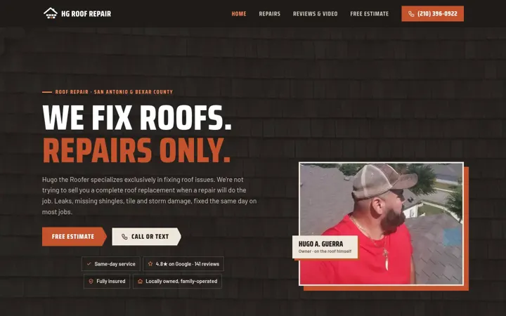
Colby's fixes on two sites only. HG Roof Repair: the services grid is a clean 3-column layout, the centred pill lists, and the rust brick restored in every reversed logo. Butter & Company: the hero and guide buttons now sit in proper button rows, the photo collage is a tidy 2-column grid on tablets and phones, the download banners no longer wrap unevenly, and the reversed logo shows the smile curve and gold seal again. Both versions (new logo and original logo) were checked at 375, 768 and 1440px. Final touches: Butter's footer links are proper 44px tap targets with even spacing, the download banners keep one clean line at desktop, and HG's pill lists never leave a single pill alone on the last line (checked every 40px from 320 to 1600px).
The 2 fixed sites
Desktop and phone views of each home page, with links to both versions.



Revision highlights
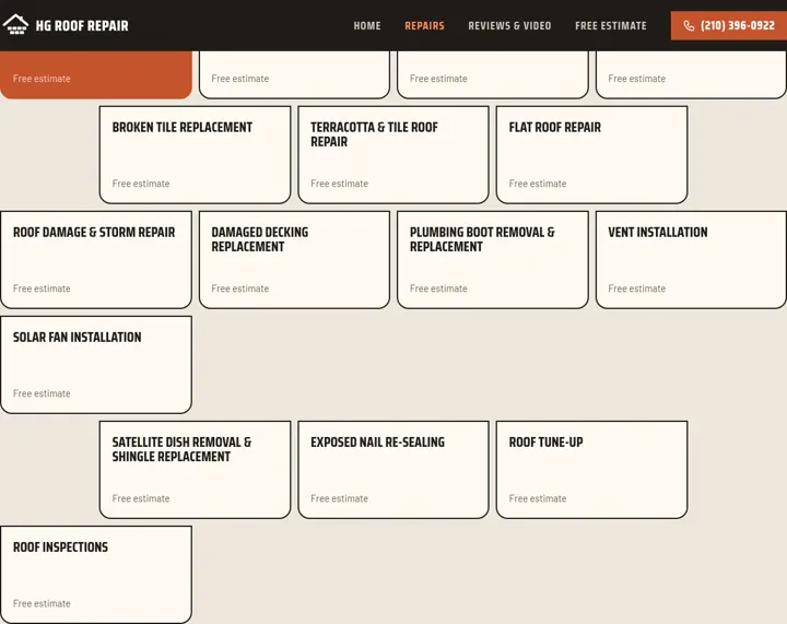
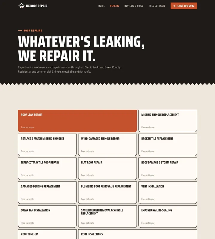
HG: services grid in clean rows
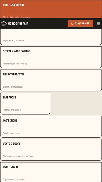
The brick offset rule that pushed cards out of line is gone. Cards sit in a 3-column grid, with the highlighted card spanning two columns. At 900px and below the cards fill a clean 2-column grid.
HG: home page at 768px
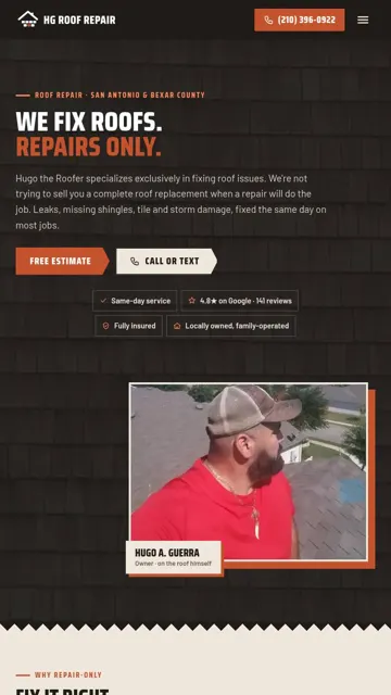
Pill lists (hero, service area, review links) are centred, so wrapped rows no longer leave a lone pill hanging on the left.
Butter: hero buttons and collage
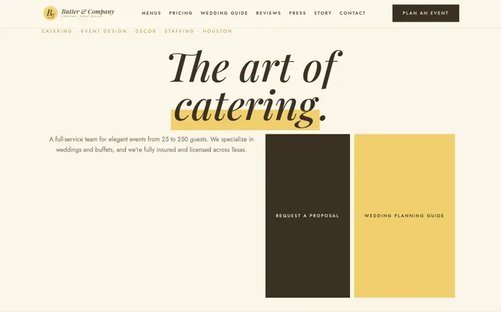
The two hero buttons sit in a centred button row instead of stretching into tall columns, and the polaroid collage is a 2-column grid at 768px and below.
Butter: tablet view
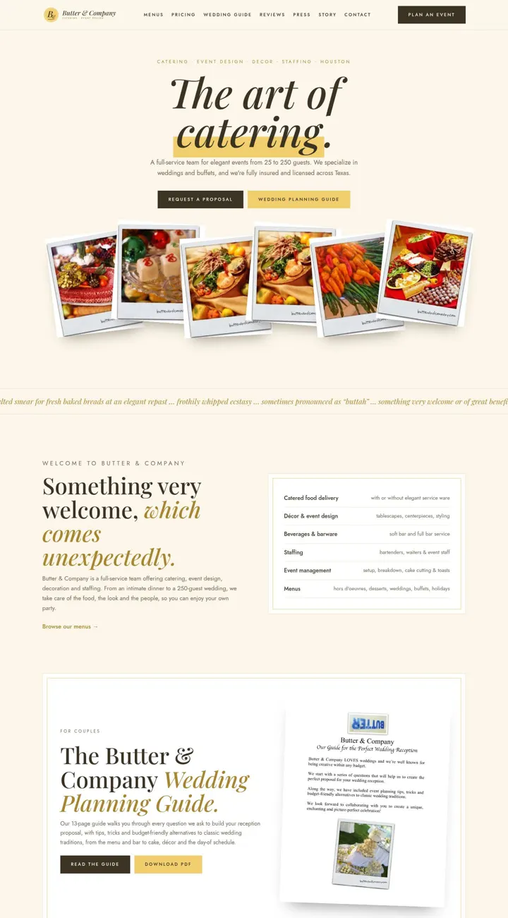
At 768px the hero text is full width, and the collage lines up in two even columns.


Butter: download banners
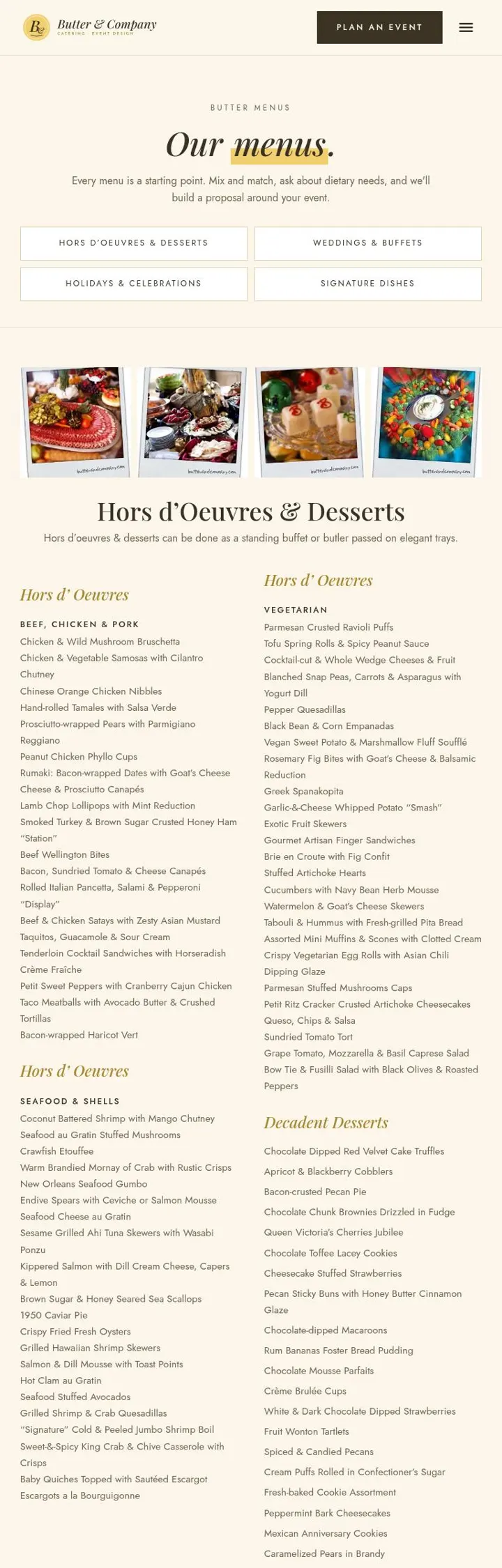
The PDF download banners on Menus, Pricing and the Wedding Guide stack neatly when they wrap, with no indented second row.

Reversed logos restored
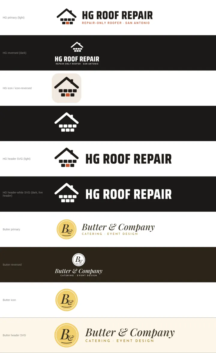
HG's reversed logos (and the live white header logo) keep the rust brick #c4532d. Butter's reversed logo shows the smile curve under 'B&' and the gold seal. Butter now has a reversed icon file, added to its logo kit zip.


Butter: footer links
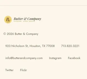
Address, phone, email and social links are each at least 44×44px, spaced 8px apart vertically and 12px apart horizontally, so nothing touches at 375px. Same in both versions.
HG: balanced pill lists
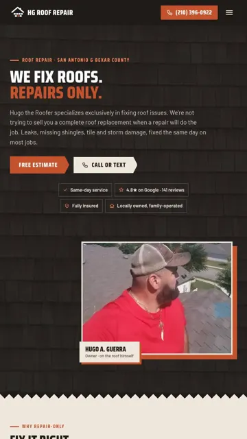
Hero chips, service areas and review links are balanced across lines. On phones the chips stack in one column and the service areas form a 2-column grid, with an odd last area spanning the full width.

Open items
- Nothing open on these two sites. The layout, tap-target, spacing, button, hero and menu checks pass on all 24 pages of both versions.
- Nothing goes to Sales until QC signs off.